In Shape
A new gallery show at the Nashville Public Library puts poetry on display
People apparently started writing shaped poetry—in which words are arranged to create a picture—as soon as they began writing verse. An exhibit at the main Nashville Public Library includes examples of the practice dating from ancient times to the present. Boasting thirty prints of poems by E.E. Cummings, Lewis Carroll, Guillaume Apollinaire, Andre Breton, Gertrude Stein, and others, the show includes work from Shaped Poetry, a portfolio published by Arion Press in 1981. An Arion companion volume, now out of print, provides the wall text that accompanies the show. It’s a compelling collection of work that occupies a space where poetry and painting overlap.
Shaped Poetry is part of the library’s Wilson Limited Editions Collection, and librarian Liz Coleman has smartly selected a show that perfectly fulfills the mission of a library gallery. “This just lived in a box in the dark,” she says. “We knew this would be a great opportunity for more people to see it.”
 Most of the pieces in the show offer straightforward renderings of the their central subjects. In “Swan and Shadow,” John Hollander arranges the words and lines to create the shape of a swan floating on the water, its mirror-image reflecting from below. Shaped poems that evoke religious imagery are often found in funerary art, and the texts of poems like “Cross”, “Chalice,” and “Altar” all closely resemble their subjects.
A number of the pieces break ranks rather drastically, however. Dylan Thomas’s “Vision & Prayer” (Wales, 1946) appears in a diamond shape that creates a pleasing geometric design but seems more preoccupied with its look than its language, offering a strong, strict image conveyed in ambiguous phrases. May Swenson’s “The Totem” represents the opposite approach. The outline of her piece ostensibly evokes the familiar silhouette of the Empire State Building, but it requires a heavy investment of imagination to see it. For Swenson, the rhythm of the line wins out, resulting in a poorly rendered picture, but a more powerful work of language.
The prints of the poems that aren’t written in English are accompanied by translations that have been given their own shapes and incorporated into overall compositions that don’t interfere with the original writer’s intentions. One piece, however, requires no translation: the exhibit’s most extreme example of abstraction is a poem that abandons language entirely. In “Fish’s Nightsong,” the German poet Christian Morgenstern creates a design made entirely of curves and dashes—the scansion marks that denote short and long syllables. All but abandoning poetry for painting, “Nightsong” pictures the opening and closing of the titular fish’s mouth. For good reason, the catalog copy calls Morgenstern’s composition “the only wholly translatable poem.”
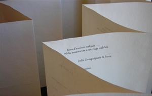
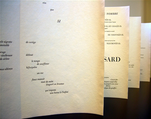
The exhibit is delightful for fans of poetry, but also for anyone with an interest in printmaking. “All of this was done on letterpress, and they chose different papers to go with different poems,” explains Coleman. “Typography classes went cuckoo for this stuff!”
The unique, handmade surfaces cast a number of compelling textures as backgrounds for the texts. Examining each piece closely, it’s possible to “feel” the way the ink has been sunk into the surfaces to enhance the moods and styles of various pieces. The lines in Robert Angot’s poem “Lute,” for example, create a picture of the small, stringed instrument; it’s printed on a thin sheet of wood veneer, effectively evoking the soundboard of an actual lute.
 Art and writing have cross-pollinated successfully during their mutual development, and shaped poetry finds its closest non-literary relative in painting. The writer and artist Bryon Gysin belonged to the original Surrealist Group in Paris in the 1930s. In addition to writing verse, he created intricate, calligraphic panels by painting successive phrases—one on top of the next—until the characters disappeared, leaving only looping, lyrical lines where there had once been text. Gysin also encouraged his friend William Burroughs to use painterly collage techniques in the composition of his novels. Their refining of the “cut-up” method had a dramatic effect on literature, film, and music during the second half of the twentieth century.
To consider a shaped poem is thus to be forced to choose between contrary activities. It’s possible to read the poem for its language, to experience the ideas and emotions the poet has suggested through words. It’s also possible to look at the image those words have been typographically organized to form, divorcing them from their meanings so that they become simply elements in a visual composition. A shaped poem is not unlike one of those figure/ground trick drawings in which appears either a lovely lady or a withered crone—but never both at the same time. The best shaped poems are compelling texts that create striking pictures capable not only of illustrating the subject, but also of reinforcing and enhancing the poem’s themes and moods as it flashes back and forth, from picture to poem, synchronized with the reader’s flickering perceptions.
“Shaped Poetry” will be on display through November 28 in the Art Gallery at Main Library, 615 Church St., and is open during library hours: Tuesday through Friday 9-6, Saturday 9-5, and Sunday 2-5.